Varsha Sreekumar
Varsha Sreekumar

Buildings Health Tracker
How do Indoor Environments influence performance and productivity?
Overview
Role
Product Strategy, Experience Designer, Product & User research
Duration
Platforms
40 Weeks
Dekstop
Mobile
Digital Signage
Tools
Team
Achivement
Figma
Miro
Paper Prototypes
Usertesting.com
Usability Metric
HW- Healthy Buildings Patent
Scrum Team
Product Manager
Product Owner
I joined this project when the scope for pre- beta release was out for development, from there I supported as a sole designer. The basic scope was planned only for the pre -beta release. My role was to understand the UX issues and enhance the product experience over time. I own the most important products across the building health tracker - timeline. Besides When I first worked on timeline back in Jan 2020, the control & features were problematic, with usability issues.
The Problem
Companies dealing with the impact of the pandemic want to resume business operations while assuring the employees, guests, and partners that their facilities are safe and healthy.
The customers want to minimize further downtime and mitigate future concerns.

BACKGROUND
50 Percent
One-fourth of businesses witnessed a
drop in sales across the world.
From the world bank
-
On average sales drop by 27%
-
34% of firms have increased the use of the internet, social media, and digital platform.
-
17% of companies invested in the new equipment software or digital solutions.
Context
-
During the mid of the pandemic many companies across the world were calling back their employees to work since a lot of them could not work from home considering their nature of work and the equipment needed for their Job.
-
The occupants were hesitant return to workplace considering high risk of spread and the building owners wanted to make sure that their indoor environment assures safety to all the employees while they are in the building.
Oppurtunity
-
What if we could use the right technology to help our customers to keep the indoors healthy and make the occupants feel safe?
SOLUTION
BUILDINGS HEALTH TRACKER
A solution that provides a holistic view of the building health including occupant flow, wellness, and density, monitors and supports social distancing helps to improve air quality to mitigate bacteria and virus spread effectively, and provides real-time updates on spatial sanitation.

Buildings Health Tracker
Dashboard for Facility and Portfolio Managers to track the health of the building and get the issues fixed fast


Mobile App
Buildings performance KPIs and Occupant app anywhere/anytime through mobility


Digital Signage
Stay up to date with the measures taken by your company to keep you safe
What is the product promising ?
Set health KPIs to manage safety, security, and air quality to measure compliance to new regulations.

People counting

Mask Compliance

Occupant Density
Indoor Air Quality

Thermal Screening
Persona & Output
How BUILDINGS HEALTH TRACKER works
As of today there is no provision for facility and portfolio managers to track the health of the building for occupants who are returning back to work after the pandemic.


First pre-beta release
Dashboard Overview
In the first release the foundation was set with minimal features was released to a few beta customers.
-
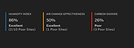
Overall Performance score of the site.
-
Pillar Scores and respective trends.
-
Overall service ticket status for each site.


What happened after 1st release
Oops, what was overlooked?
We identified a few interesting points after the first release with our Beta customers. For the next sprint, I focused on resolving these issues
-
Fewer User sessions
-
Less footfall
At this point, I am measuring how helpful is the solution. According to them, it is definitely showing the scores of the sensors but then why lesser footfall?
-
Conduct workshops to understand the root cause.
What happened after 1st release
So what did I do next ?
#1 Speak to our Users and gather Insights
I organized a session with our users to better understand how this dashboard is assisting them and what it needs, all while studying the real-world pain spots that slow them down in their daily lives. This session was conducted with five Portfolio managers and five Facility managers from different locations around the world.
#2 Re-prioritising features and plan the roadmap
From the workshop with users, I gathered a lot of new insights that were not identified before. A list of critical needs was identified. The experience outcomes were updated with the latest needs.

A few primary needs are identified
Insights

#1 Dashboard tells if the score is poor but does not inform the user about the issue and what to do next?
In the released version, only the sensor score is displayed. It does not tell the user why it is bad, average, or good. It does not guide the user on what to do next if there is any issue raised. I also noticed that there was no action taken by the user through this dashboard.
#2 The user has to switch between dashboards to troubleshoot and issue resolution. #noaction #cornerduser turned into a #monitoring dashboard.
Another major issue I saw was that the user would have to use multiple dashboards to troubleshoot and fix an issue. This need to change in order to make it useful and drive traffic to our dashboard. Switching between dashboards is a tedious task.
#3 There is no prompt for the user to visit the dashboard when a critical issue occurs.
A thorough grasp of the user's wants and expectations is essential. That is to keep them informed when something goes wrong on their site and gather feedback from the occupants.
#4 No Guide/Help for personas Improve the Indoor environment.
One of the main issues is educating the personas about how much time, money and effort they can save if the building is maintained right.

Designs
Getting to the Polaris in four Phases
A few updates on features were released step by step considering the resources available and other constraints.
PHASE 1
Added KPIs, alerts & Quick issue resolution in 2 clicks.
Health KPIs to manage safety, security, and air quality to measure compliance with new regulations.
-
Overall Performance score of the site.
-
Pillar Scores and respective trends.
-
Automatic service ticket raise and resolution.
-
Alerts & notification
-
Resolve Issues in 2 clicks

PHASE 2
Introduced sensor performance, predictive and Preventive Maintenance
-
Sensor Performance and details.
-
Highlight Issues for which tickets are raised.
-
Helps the FM/PM to make better decisions in planning Maintenance and finance.
-
Troubleshoot issues faster.
-
Introduction to predictive maintenance and interactive 3D asset vie

PART THREE
Introduction to awareness score overview for smart portfolio planning
-
List of Installed and needed sensors.
-
Systems will recommend sensors that need to be Installed considering factors like Domain, geographical location, weather, Occupants density, etc.
-
Helps the Portfolio Manager to do the budget planning and decision making considering the site.
-
Smart Portfolio planner

Obtaining the desired outcome
Because there are so many sensors in a building, controlling them and ensuring that everything functions properly is difficult. Aside from understanding how such underlying issues develop, an FM or PM must be able to simply adjust the setpoints and visualize with the revised experience. With the recent changes to the live site, this has become extremely simple, with auto ticket generation and resolution, as well as smart recommendations. I also revamped the information architecture, updated the XOs, and redid feature prioritization based on the demands of the personas. The team developed a few features from the most recent design, and I continued to design with the big picture in mind, slowly adding functionality.
Before

After


Highlights
What are the highlights of this product and Journey
#1 Reduced the number of clicks to 2 for issue resolution.
The previous flow had a lot of clicks (8 clicks) and I was worried that will frustrate the user and they will stop using the buildings tracker dashboard.
Before


After
#2 Introduction to AI for portfolio planning and issue fixing
-
Improved the recommendation with customised messages by removing generic messages for similar issues.
-
Quick issue resolution was introduced, both manually and automatically.
-
Introduced a portfolio planner that can analyse your previous year's performance and generate a report with an overview of the portfolio's performance and planning recommendations for each site.
#3 Introduction to Awareness tracker dashboard for Portfolio Manager. (Redefined the feature set for this persona)
-
Considering portfolio managers as a user I focused on designing a new dashboard that helps them to do their job and showed relevant information only.
-
The feature set and actions were redefined for this persona.
#4 It is okay to fail
-
I am learning how crucial it is if not user-focused.
-
Bringing up a product that was not used by the users as expected brought in a lot of concern about the sustainability of the product in the market.
-
Learning with the users.

Behind the scenes
Process
Timeline
Brief timeline considering all the products

User Journey
High-level user journey for dashboard and mobile including all the personas and different touch points.

Story Board & XOs
High-level user journey for dashboard and mobile including all the personas and different touchpoints.
.png)

Wireframes
Multiple iterations on all the wireframes considering user feedback after testing.


User Testing
Feedback on all the products has been gathered regulary.

Impact
After releasing the product to a few customers we gathered these interesting data considering the development constraints.
76
Users in 7 days
20%
Quicker issue resolved
280
Unique users
-
Regular iteration based on user feedback.
-
Regular tracking on localytics
-
Filed a Patent
Future of the offering
Future of the offering
When adjusting to the "next to normal," the aim is to offer assistance to the building owners/customers to assure their occupants that their Indoor health is safe.
-
Bring in green and sustainable concepts.
-
Include more pillars to improve the environment.
-
Introduce positive employee experiences, administrative control, better space experiences, and enhanced portfolio management.