Varsha Sreekumar
Varsha Sreekumar
Forge Digital Services
OpportunityTool - For product managers.
Designed to enhance aftermarket operations for businesses across various Honeywell industries.
High-level overview as the opportunity tool is a sub-product
Digital Service Suite
Digital service is an end-to-end product suite that accelerates the capability of global Honeywell business groups to monetise value from their installed base, while helping customers reduce unplanned costs across their sites. Opportunity tool is one of the tools that will help this big vision.
Our product suite includes
ROLE
2022 - early 2024 :- was the only designer supporting .
2024 :- Led a design team including 3 design contractors and 2 internal designers for the same project.
Timeline
Nov 2022 - Dec 2024
Digital Services consists of 5 interconnected apps serving different personas
-
Admin Portal ( This is where we onboard our customers)
-
Connect & Collect (We onboard the install base to the cloud here)
-
Customer Portal ( Helps customers reduce the cost for their sites)
-
Opportunity Tool ( For Product Managers to identify opportunities)
-
Maintenance Assist (Our chatbot )
Detailed case study
Opportunity Tool for Offering / Product Managers


What is the problem ?
Honeywell has a huge customer base with critical assets in the field. Those assets generate large volumes of raw data. But that data is underutilised, because there is no continuous collection, no structured system to analyse it, and no historical record to act on. We need to monetise data from these asset bases for Honeywell's global business.
Why is this a problem ?
Honeywell is unable to tap into the full potential of its customer and asset data due to three main issues.
-
Difficulty in identifying customer-specific opportunities because of infrequent communication.
-
Challenges in gathering this data because it is scattered.
-
Lack of historical data, which limits the ability to offer remote monitoring and optimization services.
A little data to backup the claim
$11B
Aftermarket revenue at stake annually
Honeywell's services represent ~30% of total revenue, its highest-margin business. With no tool to identify opportunities inside the installed base, a meaningful chunk of that pool was leaking silently every quarter.
Honeywell Annual Report 2022
<30%
Of aftermarket potential captured by industrial OEMs
Across industrial OEMs, over 70% of available aftermarket value parts, renewals, service upgrades, goes to third parties or disappears entirely.
Without a system to surface it, Honeywell's OMs faced this same structural loss.
SBT Annual Report 2023
23 M
Connected data points, zero actioned for service
23 million data points on the Forge IoT platform.
The data existed at scale, but with no tool to translate it, that infrastructure was generating signal with nowhere to go
Honeywell Annual Report 2023
I started by mapping the ecosystem
As a first step, I conducted and led a DT workshop for us to filter the ideas, finalise a direction, identify the right areas, and come up with an ecosystem
Started discovery workshop with stakeholders ( Offline & Online )

Mapped the apps & personas and Domains
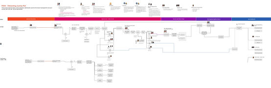
Mapped the similar customer and user needs identified with all Honeywell domains
Glimpse of my work board. Let me know if you want a detailed walk-through of my thoughts.


Who am I building this for - Building empathy with my users
User research and problem validation
1.Got these basic questions filled

2. Identified the personas
Primary : Offering/ Product Managers

Secondary : Service sales managers

3. Justification : Why the offering/Product manager is the right persona?
-
Because they sit at the intersection of data, revenue, and the customer relationship, and they had the most to lose from the status quo.
-
The Offering Manager is the person whose goal is to grow service revenue from the installed base.
4 .Site visit & online interviews to learn about users

5. Data synthesis and research report out


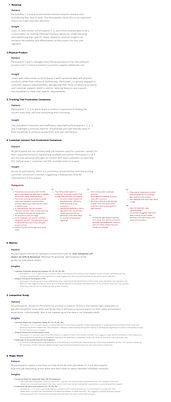
6. Persona Redefined


7.Tools used by my users
-
Tableau
-
Excel sheets
-
Honeywell Internal legacy tools
-
Confluenc
-
External tracker tools of choice.


8. Identified the impact on my users
Collaborated with experts in the organisation and the data I gathered for this information
70%
of an Offering Manager's time goes to non-selling tasks, reconciling data across tools, managing internal stakeholders, and chasing updates that should surface automatically.
4-8
tools the average PMs switches between just to form one view of one customer. Every switch breaks context. Every broken context costs a decision.
1-2
full days lost every week to admin alone, time a PM should spend on product strategy, customer relationships, and identifying what to sell next
54%
of the average workweek consumed by data handling and preparation, not product thinking, not customer conversations, not revenue decisions.
Insights : Primary Focus Areas
After connecting with my users, I filtered these common points that will help my users to do their tasks easily and these can make their lifes easier. Once identified I divided all the requirements into these 3 Insight categories.
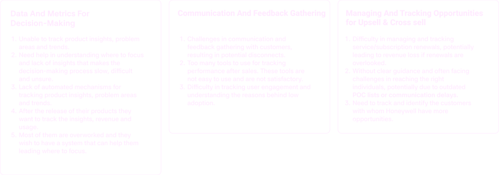.png)
Towards The Solution
Conceptualisation
I started with creating user journey, experience outcomes, IA and low- fi concepts for the primary use cases. many features were altered based on the tech feasibility. After having go ahead from the business, product and other subject matter experts this was converted to high fidelity for testing. As the plan was to test it with external users. Once we had confidence in the design the dev ready files were completed.
1. Experience outcomes


2. Updated User Journey + IA


3. Wireframes


The Solution: An opportunity tool for Product managers
The nerve centre that tells product managers where the money is, who needs attention, and what to do next
Insight 1: Managing and tracking up-sell and cross-sell opportunities
.png)
<---- Design after feedback
<---- Design after feedback
1. Overview with needed KPIs
-
Overview of the customer base, including the revenue details in one place.
-
The user has access to all the Issues with a resolution date.
-
The KPIS are aligned with the needs of the SSMs & Offering manager.
<---- Design after feedback
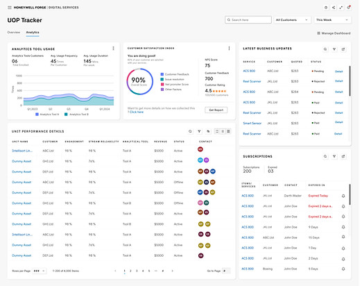
2. Customer opportunities and satisfaction analysis
-
Analytics tool usage data and customer satisfaction to track user engagement data.
-
The purchase details data and subscription information inform the SSMs & Offering managers about the status of the sold services and the potential services/warranty.
-
This tool lets the user find the respective point of contact responsible for each issue on the customer’s end.
-
The user can also get the feedback recorded directly from the customers, unlike before (They had to switch between multiple dashboards to gather this data).

<---- Design Upgrade - New feature
2. Customer opportunities and satisfaction analysis
-
We also realized during first few UTs that every user have different priorities in terms of KPIs.
Insights 2 : Detailed Asset 360 analytics & root cause, report analysis with AI recommendation.


All Domains- Plants, warehouse, buildings

1. Asset 360 level details that help the user to understand the depth of the risk.
-
Listing out the opportunities for the offering managers for each customer.
-
The asset 360 details help the SSMs and OMs to provide better products and services to the customers with data.
2. Root Cause Analysis With AI recommendations
-
Based on the type I studied and implemented multiple data visualisation methods and also provided. recommendations to fix it.
-
The recommendations also lead you to the right pages to purchase or contact HW POCs


Connected Assets
-
This feature helps the Product Managers to find opportunities with assets that are connected through prediction and helps our customers to make decisions faster.
Only for Aerospace - Business decision

Insights 3 : Asset recommendation and summary report for faster decision making + Introduction to chatbot
-
A glimpse of what the recommendations look like, with evidence on why we think users should be taking some actions. This will help the user to focus on the problem more and troubleshoot less.
-
The Chatbot also helps the user with any questions related to assets and services.


Demo
Screen flow is currently removed and can be shown in direct connect.
User feedback on first drafts - Major changes
Feedback
Customer overview landing page
Before
I liked how you are showing the customers into multiple cateogories. We don't use regular in our domain, can we change it ? Also how are you predicting the growth rate ?
The visualisation is refreshing, comapred to what we use.
I am able to understand the data easily, I liked how this has come up
I liked the Issue metrics, It shows me the asset criticality, are you planning to connect this with our BMS systems? How are you pulling the seveirty score and what team will do the

I would be really happy to use this. Will you be able to pull the revenue data from our systems ? Check with the legal team?
The revenue data is what we need exactly. Is there a bad revenue score that you are planning to show? We don't track that yet. Not sure if we can set a revenue goal.
1. We won't need the activity feed here as there will be no daily updates coming up.
2. Will there be a provision for me to have my top customers data who are performing poor ?
3. Can I see what would be the health of my product ? Like if it falling in the planned score or not? (3/5 users*)
.png)
Added
Added avg. health score for the user's product
Removed the activity feed and combined that feature with notifications. A notification settings were also made
After
Highlighted issues along with customers to drag the user's attention to the critical users
Analytics and tracker page
Unit performance table is promising , only if you guys can get the data for expiry accurate
I love this . To get this much data today I jump between 3 tools inclding the SFDC. Someday I would want to chat with my customers diretly from here
Before
The top ribbon is not the KPIs we track always for APC. Maybe the priority needs to be updated
Eng:- We can't get this data for first release. The installbase is yet to give us permissions.
The light theme looks really good and I am bored of the dark theme.

The subscription tracker will be a life saver. I remember you mentioned about the detailed page for this KPI . Will that be released for Beta ?
After

The pay and pending status along with the POC is what I needed the most when tracking a status. I am doing this manually today in collab
The customer satisfaction report can actually save my portfolio reviews with the leadership every PI .
Connected assets and redesign of health tab
Before
In the intial design the connected assets were under health . Even though we got good feedback from the users, It didn't sit right with the data grouping

After
I added more data visualisation for comparison. rather than table data.

I changed the connected assets to a seperate page with interaction like the PM can get a 360 view of any assets, cretae tickets etc. directly

Navigating chaos
The map view saga
This created a lot of back and forth, and shows how explaining user psychology and behaviour can shift a strong stakeholder position.
-
Leadership wanted a map view to show all customers for the offering managers.
Challenges
The Tool is already data heavy and having a map for persona will be visually heavy and
How did I solve it
-
We highlighted the need to show the high priority data that will lead the user to take action.
-
The map can make the user spent more time on with too many points since offering managers deal with customers across the globe.
-
The user behaviour and psychology were explained to the stakeholders to convince them.


Impact Measurement
How did the users & business find this solution
My Users - Offering / Product Managers ( as per product team - Not validated by me )
80%
Less time on reporting. Single dashboard replacing 8 tools.
+208%
Revenue. Better Internal team alignment on one data view
37X
more likely to hit target. AI opportunity ranking.
10-15%
Efficiency gain. Automated data surfacing
36%
higher revenue growth. Centralised customer+ Asset intelligence
Learnings
What this project taught me?
Simplicity enhances impact
-
The most simple solutions are not just aesthetic but impactful and user adoption .
-
The clear the design the stronger the connection. As designers we often tend to deviate and attracted to out of the box and trendy dribble shots. But, we must remember the primary goal of the user and ‘why’ part.
Constant communication and collaboration
-
Collaborate and communicate at the right time to be in sync with Business, Products, and Dev.
-
Workshops and working sessions started becoming more fun, and the team dynamics changed, we started helping each other.
Prioritise
-
Polished my prioritisation skills and created a proper plan for chaotic projects.
-
This helped deal with out-of-scope requests that could derail the project and helped deliver a quality product on time.